Trinko

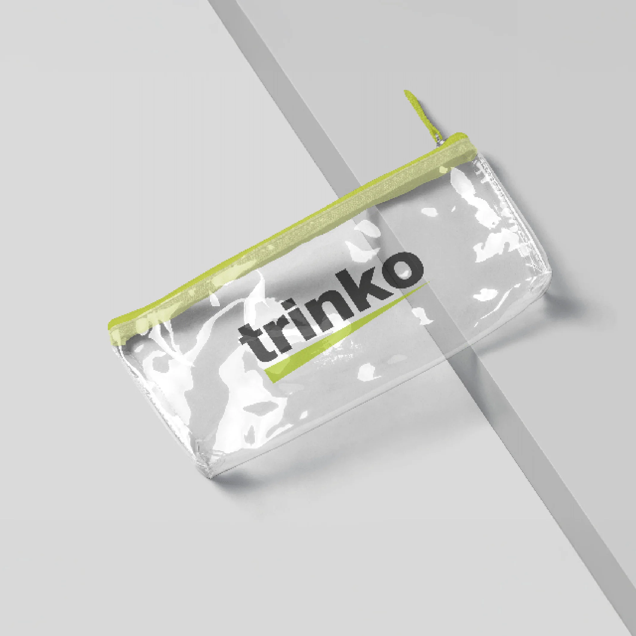
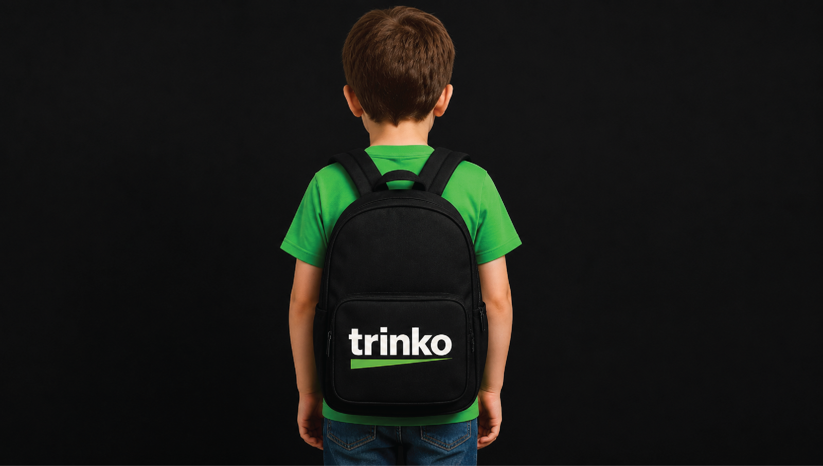
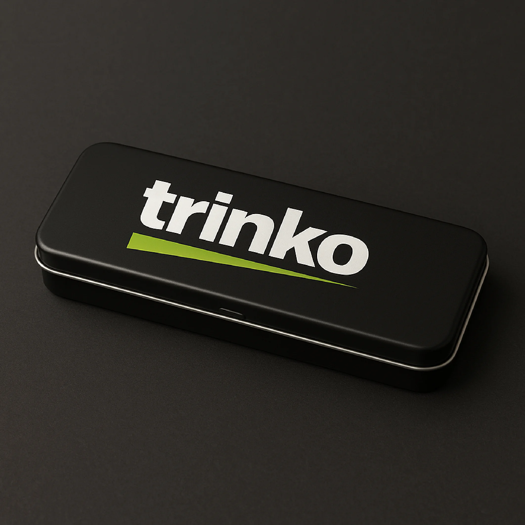
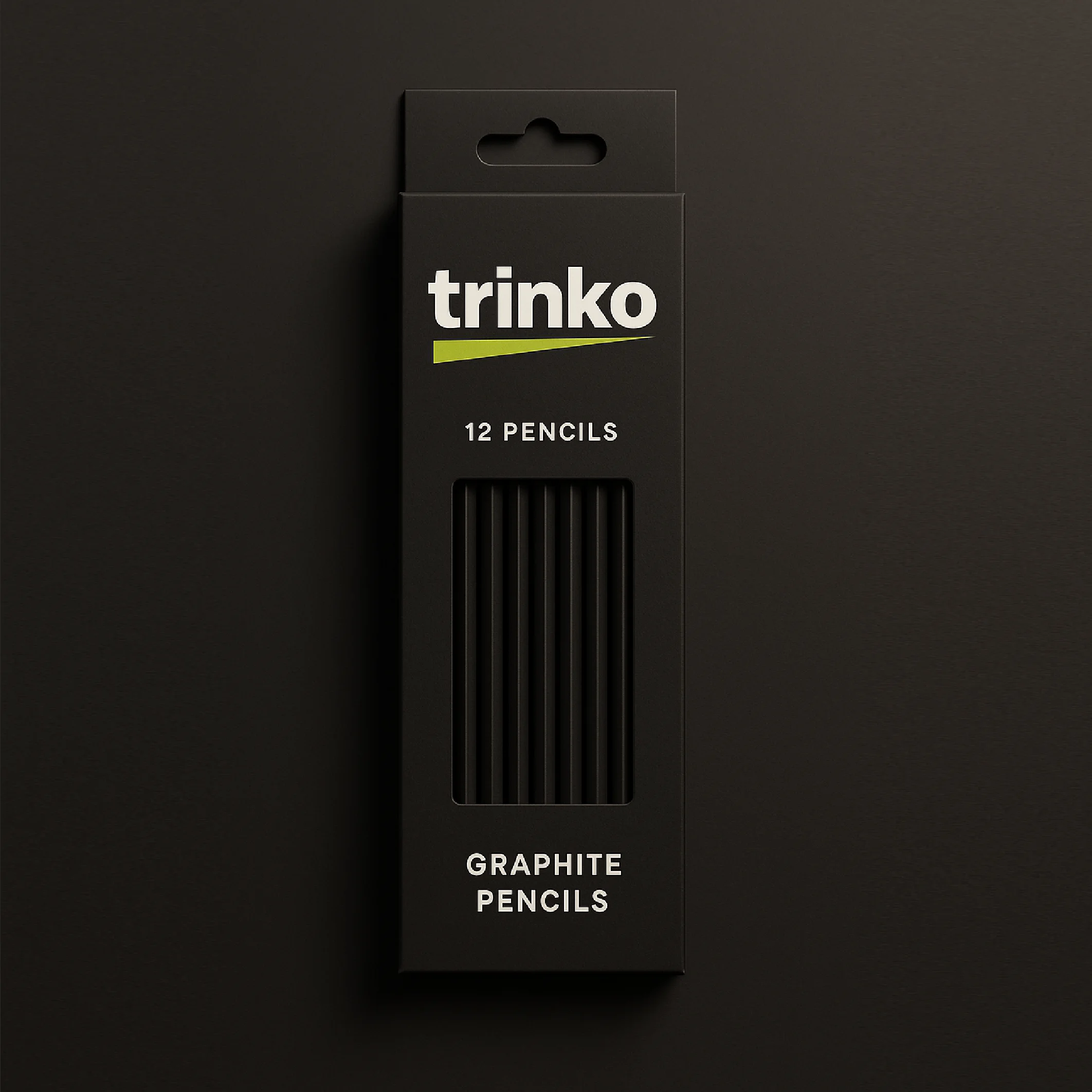
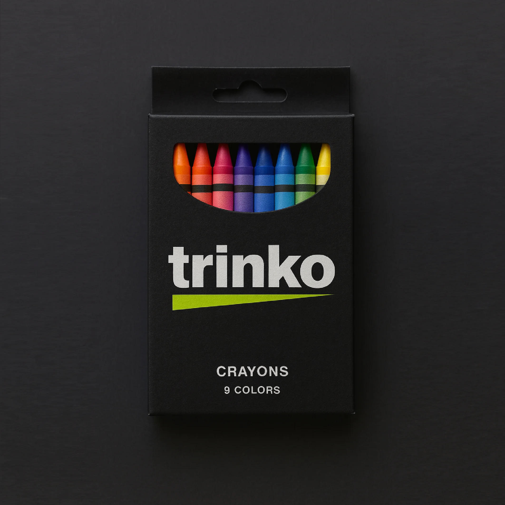
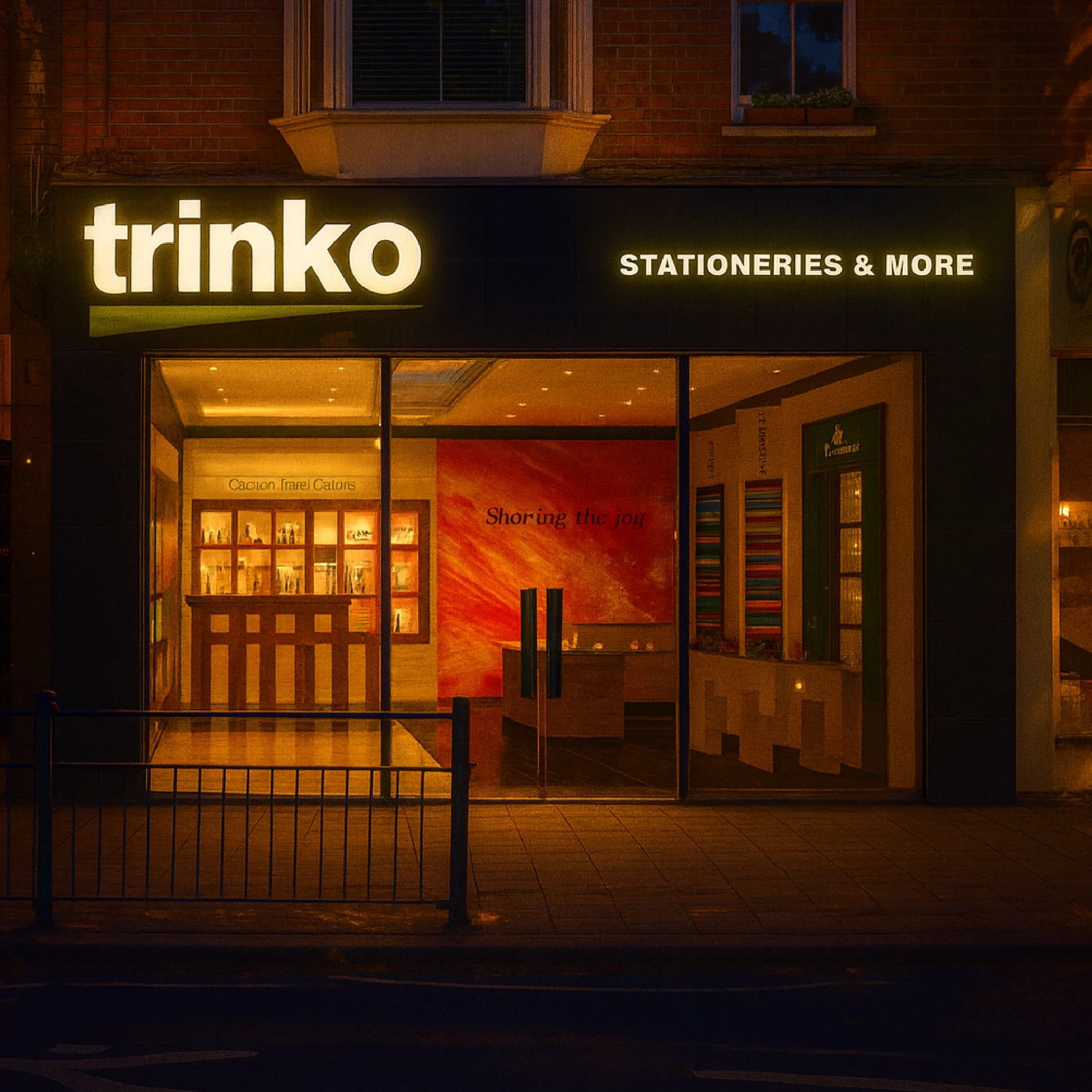
n a crowded stationery market, another logo only adds to the noise.For trinko, a Bangalore-based brand, we chose focus over decoration. The brand doesn’t hide behind symbols. It declares its clarity with bold typography and a sharp dash, a stroke of identity that runs across every product. Logos may change. Fonts may trend. But a single-minded idea endures. trinko positions itself not just as crayons, pencils, or geometry boxes but as a brand built on simplicity, modernity, and the discipline of design. In branding, the strongest mark is not what you add. It is what you leave out.
Client

Trinko

Challenges & Objectives

/ Project Overview

We collaborated with Envato to create a visually striking and engaging brand identity that aligns with their core values. Our team focused on delivering a seamless and user-friendly experience while maintaining a bold and modern aesthetic.

/ Challenges

Creating a brand identity that appeals to both young and mature audiences.

Ensuring the website performs well across all devices.

/ Objectives

Develop a visually unique and recognizable brand presence.

Create an engaging and intuitive user experience.

Enhance the brand’s storytelling through compelling visuals and motion design.

8
7
TRINK MOCKUP
5
4
3
2
1

Creative
process

We started by conducting in-depth research on the industry, competitors, and target audience. Our team then developed multiple design concepts, refining them based on feedback and usability testing.

Concept Development – Brainstorming initial ideas and design directions.

Design Execution – Creating high-fidelity visuals and prototypes.

Implementation – Bringing designs to life through web development, motion graphics, and interactive elements.

Final Testing & Launch – Ensuring optimal performance and user experience.